Website and logo redesign
Earthdance
Organic Farm School Ferguson
Growing a new website for a farm
Stale
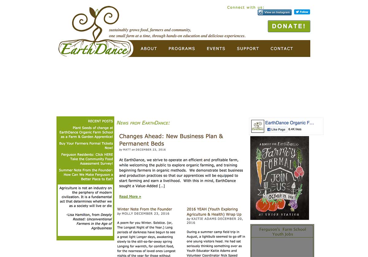
Earthdance had an old, stale website with layout and content issues. They wanted a fresh new look, and they wanted to better organize the information in the website.
The old site
As you can see, the old site has some major issues. First, there is a big pothole under the navigation where their featured image section had broken. Second, the page is broken into several columns. This creates a an unfortunate phenomenon called info barf. When you make colums you actual make each column fight for attention. It’s like having multiple people talk to you at once. Thus, you have to ignore every column but the one you want. Since the main column is the one you focus on, you contition your viewers to ALWAYS ignore your side columns. Now, that extra info you provide is NEVER viewed.

Fresh
We designed and developend a fresh new website that was easy to manage and navigate. We used “layers” instead of columns to organize the content into single purpose sections. No more “info barf.” We wanted the homepage to slowly intoduce what Earthdance does. No need to say everything at once, just scroll down and it will introduce the next section without conflicting content.
We used a great pluign for WordPress called “Advanced Custom Fields” to allow for more advanced page management and customization.
Technical

