Website and logo redesign
The School for Ethics and Global Leadership
Semester School D.C.
You will know when it's time for a redesign
Problems
Shapes
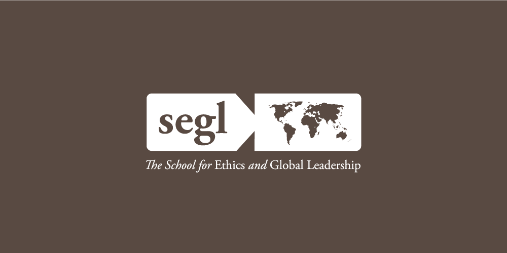
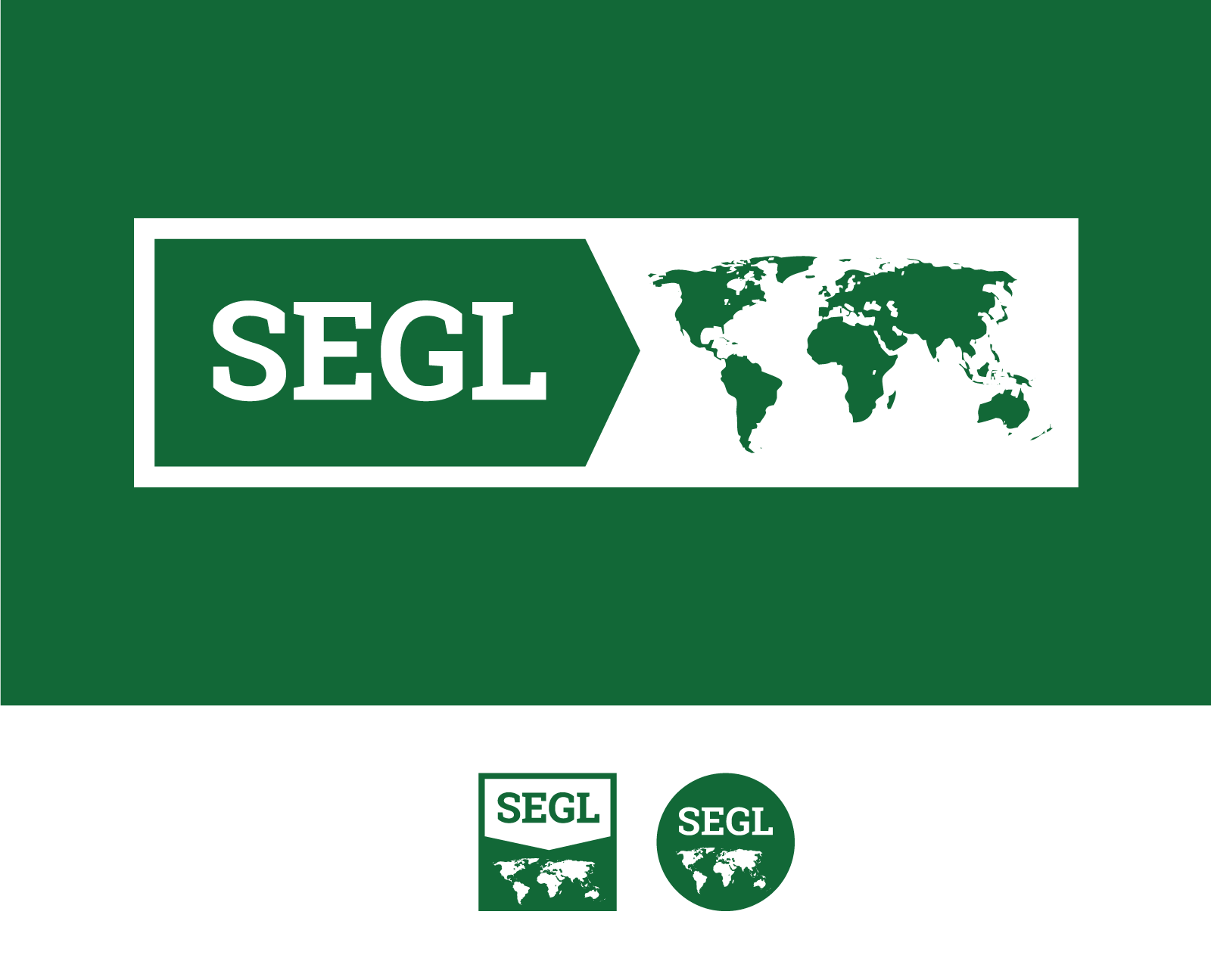
We improved the old logo by making subtle yet cool changes to it. First, we ditched the lowercase letters. Lowercase lettering was more popular in the early 2000s. Second, also changed the font from Garamond to Museo Slab. We wanted to keep the traditional look of serif letters yet use a more modern serif. Third, we got rid of the Kodak like side cuts that pointed to the map of the world. Instead, we set the logo to several geometric shapes that made it timeless and stable. Lastly, we made a rectangular, square and circular version of the logo. This enables SEGL to effectively use their logo in round social media profile images, rectangular website layouts and client logo grids. Overall, it was important to keep the new logo familiar to SEGL’s community-and we did that.
Old Logo
New Logo(s)

“You made our logo even better!”
Website
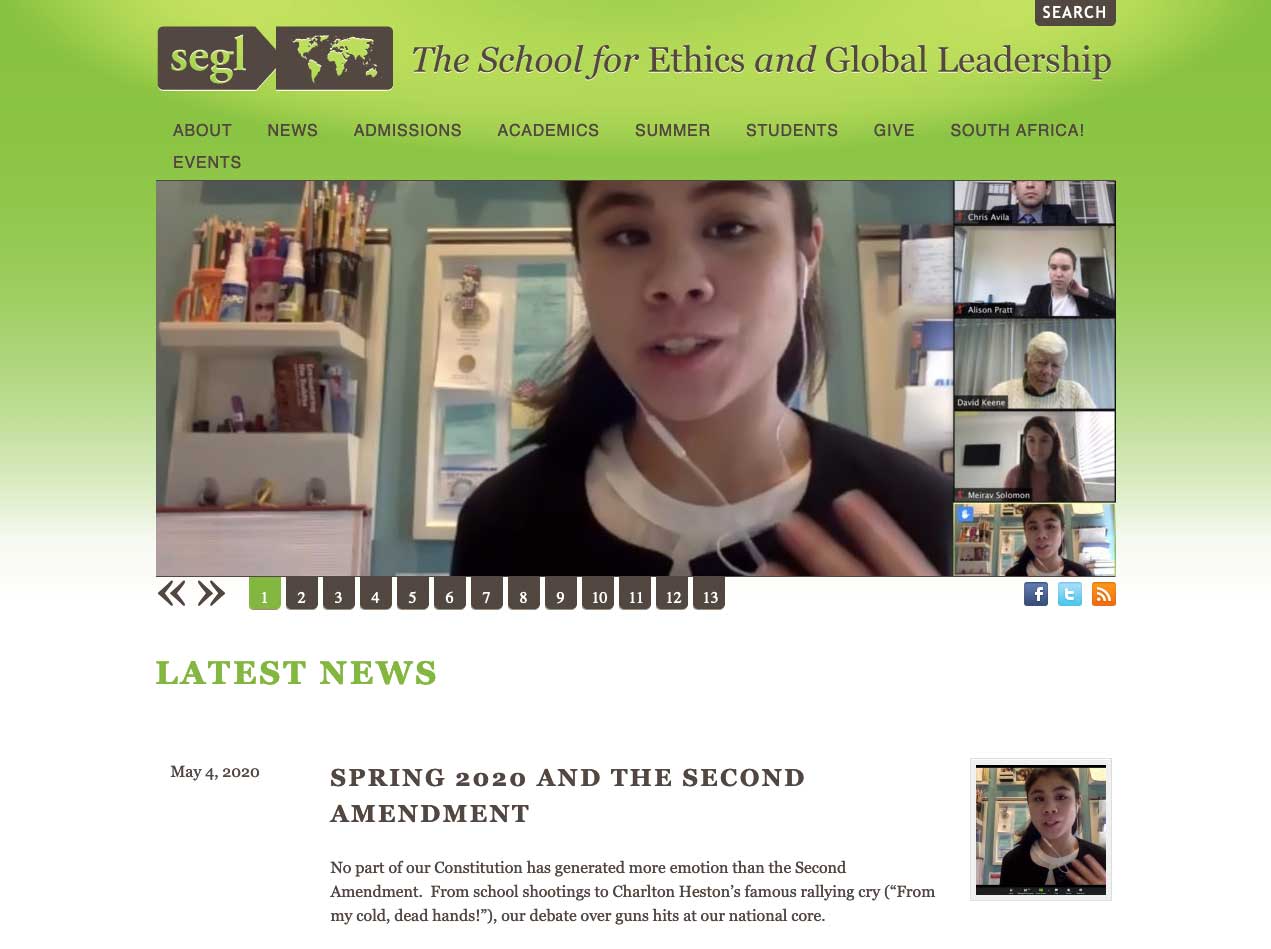
SEGL’s current website was thriteen years old and was showing signs of againg. The image slider at the top is a relic of the past, and so is the gradient background. The old site wasn’t responsive either-it wasn’t optimized for viewing on mobile devices.
Old Website
New website
SEGL wanted to both improve the look of their website and their ability to manage the content in the site, especially the home page. To achieve this, we redesigned the site to function as a stack of movable layers. Each layer serves a single purpose for clarity and can be updated and repositioned anywhere on the homepage.
We also converted the website from WordPress to Hugo and Forestry. We wanted to take advantage of static site technology for speed, security and fast customization. Making this change also enabled SEGL to delete 20GB of bloated WordPress nonsense. This further allowed them to save on hosting fees too.
WIP
