Website and logo redesign
St. Louis Artworks
Job Training in the arts STL
Redesign at the right time
Opportunity
St. Louis Artworks (SLAW) wanted to completely redesign their website. Their old website had become stale and they wanted to improve their look online before a mojor effort to raise money for the program.
Old Website

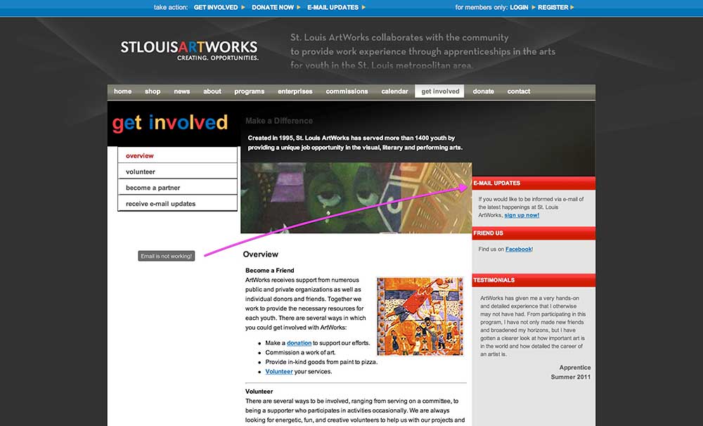
The old website had all the issues of websites made in the early 2000s. First, it had the three-column layout, which meant the main, center column of content is sandwiched between a left and right column. The idea behind this layout is to present as much information as possible. However, it makes for a visually busy look that competes for visitors’ attention. Furthermore, it can cause some to ignore the content on the left and right columns. We wanted to do away with the three-column format.
The second issue is that the navigation is broken into three areas — top, main, and left. Again, competing elements that cause confusion. We wanted the redesign to unify these into one navigation bar.
The Fix
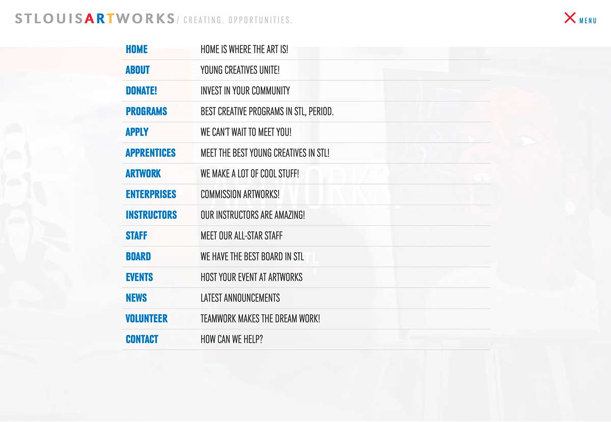
As you can see, we killed the columns and used layers instead. Using layers allows viewers to focus on one thing at a time and helps them interact with your site at a comfortable pace without competing content.
We put the entire navigation under a menu button at the top of the screen. This navigation disappears when you scroll down, but it instantly appears once you start to scroll back up, thereby adding convenience.
Google Analytics
We used Google Analytics to tell us which pages of the old website received the most traffic. After finding that the “Apply” and “About” pages were most popular, we designed the homepage to allow teens to apply to the program, and we included a section about SLAW that provided high-level info about the program. With the help of Google Analytics, we were able to make informed decisions that guided the website redesign.
Awards


